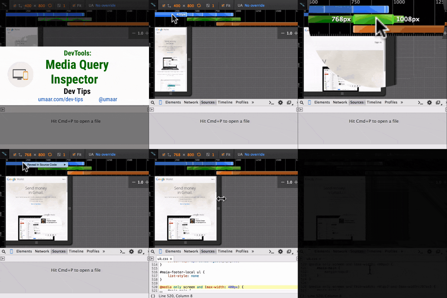
Chrome DevTools: Inspect and trigger CSS media queries, also locate them in code
Last updated: June 10, 2015
Introduction
DevTools has a quick and easy way to activate and trigger to various CSS media query query breakpoints which a page may use.
For example, consider a webpage which uses CSS like this:
@media only screen and (min-device-width: 320px) and (max-device-width:480px) {
	header { /* Extra styles */ }
}
Rather than resizing the browser viewport manually, you can use this feature.
How to use this
Use the Media Query Inspector to inspect and trigger the registered breakpoints on a page.
- Activate the Device Toolbar
- Ensure Show media queries is enabled (the three dots in the Device TOolbar)
- You can now click the various horizontal bars which represent the different media queries which are registered.
Extra notes
You can trigger the various breakpoints with a click on a bar, but also, if you right click on a bar, you can reveal its position within the source code.
Extra resource
You can control specific device sensors from the DevTools Sensors Pane.