Chrome DevTools: Accessible colour suggestions for low contrast text
Last updated: September 4, 2020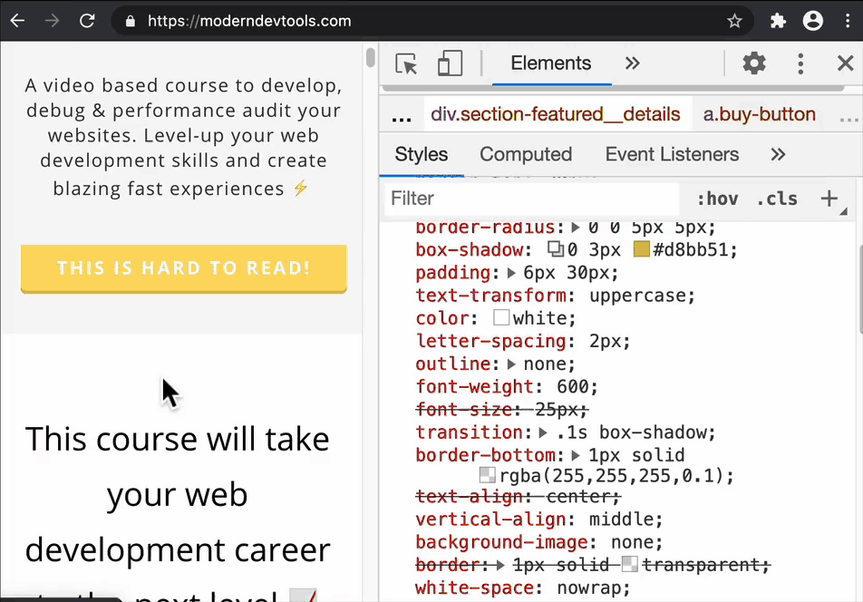
Introduction
For a while now, DevTools has been able to check whether the foreground text colour has a good enough contrast against the background color.
The contrast ratio tool typically presents a colour spectrum where you can experiment with finding more accessible colours to make text more legible. This process is now even easier as DevTools provides an accessible colour suggestion which you can apply with a single click.
How to use this feature
- Inspect a text based element with Chrome DevTools.
- Locate the
colorproperty (it's in the Styles pane). - Next to the
colorproperty, select the small coloured square. This opens the colour picker tool. - Select the text labelled 'Contrast ratio'.
- Select a colour suggestion.
Conclusion
Applying minimum contrast ratio (AA) or enhanced contrast ratio (AAA) colours to text on your page can greatly improve the legibility for your users, so do try out this feature - it's currently in Canary but should make its way to stable soon.
Extra: Aside from suggesting accessible colours, DevTools can also suggest an entire colour palette based on the colours it has determined are present on your page.